If you are finally making the jump to Elementor Flexbox Containers, you’ve probably realized that clicking the “Convert” button isn’t always magic. Sometimes it works perfectly; other times, your entire page layout explodes.
Here is exactly how to safely convert Elementor sections to containers, fix the inevitable layout breaks, and actually get the performance boost you were promised.
⚡ Quick Answer
How to Convert Elementor Sections to Containers (Without Breaking Your Layout)
Warning: Never delete the original section until you have previewed the new container on mobile, as complex column layouts often require manual alignment fixes.
What “Convert to Container” Actually Does
Most tutorials skip this, which is why people break their sites. When you click “convert to container elementor,” the system does not magically transform your existing HTML in place.
Instead, it duplicates your section and creates a brand-new container directly underneath it.
More importantly, it completely shifts the underlying CSS. You are moving from a rigid, percentage-based column system to a dynamic Flexbox system. Elements that relied on column widths will now follow flexbox rules (Grow, Shrink, Align, Justify). If your layout relied on margin “hacks” to align elements, those hacks will not survive the conversion.
Before You Convert (Critical Checks)
Amateurs click “Convert” and hope for the best. Pros prep their layout. Before touching that button, you need to check for four things:
- Backup your page: Duplicate the page or save a revision. Never convert live pages without a safety net.
- Check custom column widths: If you have highly specific percentages (like 33.3% / 66.6%), flexbox might misinterpret them as fixed pixels or wrap them unexpectedly.
- Scan for absolute positioning: Elements dragged into place with absolute positioning often fly off the screen when converted to Flexbox.
- Look for negative margins: The old section-column spacing relied heavily on negative margins. Flexbox hates negative margins.
Containers handle space dynamically. Forcing legacy column CSS into a dynamic flex environment is a recipe for a broken site.
Step-by-Step: Convert Elementor Sections to Containers
Follow this exact process to ensure a safe transition:
- Select the Section: Open your page in Elementor and click the six-dot handle of the legacy section you want to upgrade.
- Click “Convert”: In the left-hand editing panel under the Layout tab, locate the “Convert” button and click it.
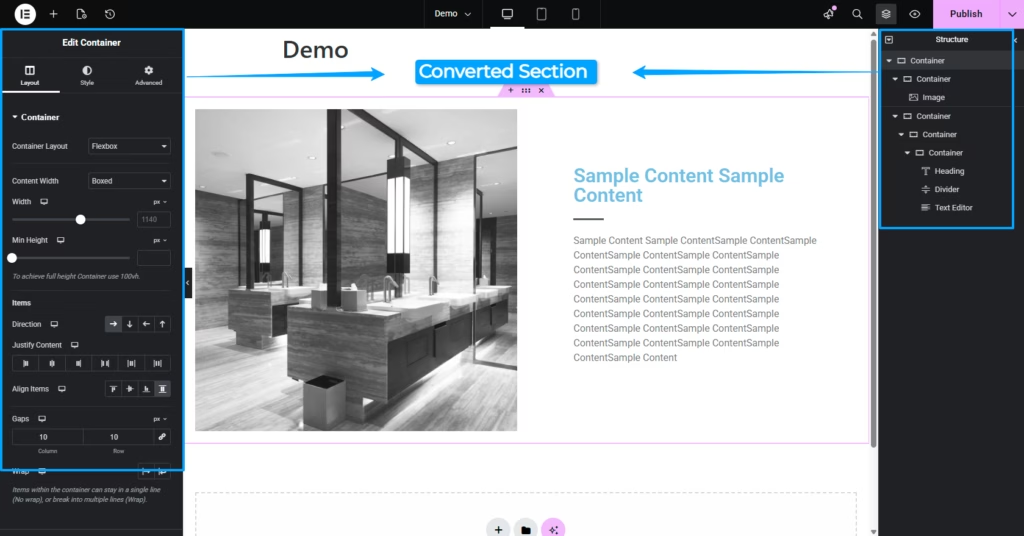
- Locate the New Container: Scroll down slightly. Elementor has generated a new Flexbox container below your original section.
- Delete the Old Section: Only after you have tested the new container across desktop, tablet, and mobile, right-click the old section’s handle and click “Delete.”
Common Problems After Converting (And How to Fix Them)
If you need to fix layout after converting Elementor sections, here is your troubleshooting guide for the most common elementor container issues.
Layout looks broken or stretched
- Cause: Flexbox vs. columns. You are forcing rigid column rules into a flexible environment. Elements stretch or shrink unpredictably.
- Fix: Select the parent container. Check your “Items” settings. Adjust the Direction (Row/Column), Wrap (No Wrap/Wrap), and Justify Content settings to properly control how elements behave.
Spacing is completely off
- Cause: Old sections used heavy padding/margins on columns to create space. The conversion tool tries to port these over, resulting in doubled, awkward spacing.
- Fix: Strip away the custom padding and margins on the inner elements. Instead, use the parent container’s Gap setting to create uniform space between items.
Elements stacked incorrectly
- Cause: The conversion tool guessed the wrong Flex Direction.
- Fix: If elements should sit side-by-side, set the Container Direction to Row (→). If they should be stacked vertically, set it to Column (↓).
Mobile layout is messed up
- Cause: Responsive breakpoints from the old column system (like setting a column to 50% width on mobile) rarely transfer cleanly to Flexbox.
- Fix: Switch to mobile view immediately. You will likely need to change the Container Direction to “Column” and manually adjust element widths to 100%.
When NOT to Use Convert to Container
Not every section deserves the automatic button. Be ruthless about when not to use it. You should rebuild manually instead of converting if you have:
- Complex nested sections: If you have inner sections inside inner sections, the converter will create a nested nightmare of unnecessary containers.
- Heavy custom CSS layouts: If you wrote custom CSS to target .elementor-column or .elementor-row, the conversion will break your styling because those HTML classes will cease to exist.
- Pixel-perfect client pages: If a client signed off on a hyper-specific, rigid layout, auto-converting is too risky.
Manual Conversion vs Automatic
Let’s look at the brutal truth about upgrading your site architecture.
| Feature | Automatic “Convert” Button | Manual Rebuild |
| Speed | Instant | Slower (takes minutes per section) |
| Code Cleanliness | Messy (carries over legacy spacing/margins) | Extremely clean (uses native Flex/Gap) |
| DOM Size | Often retains unnecessary wrapper divs | Minimal DOM size |
| Best For… | Simple text, image, and 2-column sections | Complex headers, grids, and nested layouts |
Performance Benefits of Containers
Why go through this hassle at all? Elementor Flexbox containers offer serious performance upgrades—if done correctly.
- Less DOM: They eliminate the redundant wrapper divs required by the old section/column architecture.
- Faster load time: A lighter DOM means browsers render the page faster, improving Core Web Vitals.
- Better responsiveness: Flexbox handles screen resizing dynamically without needing absolute pixel breakpoints.
The Reality Check: You only get these gains if you clean up the code. If you auto-convert and leave old margins, padding, and unnecessary inner containers untouched, your site won’t get any faster.
Pro Tips for a Smooth Transition
- Convert one section at a time: Never scroll down the page clicking “Convert” on everything. You will lose track of what is broken. Convert, fix, delete the old, move on.
- Use the Navigator: Drag-and-drop becomes chaos when original sections and new containers overlap. Use the Elementor Navigator (Cmd/Ctrl + I) to see exactly what you are clicking.
- Always test mobile immediately: Don’t wait until the whole page is converted. Fix mobile layouts for each section as you convert it.
- Clean up old sections: Don’t leave hidden, deactivated sections “just in case.” Once confirmed, delete the legacy sections to actually reap the DOM performance benefits.
FAQ
Does converting affect SEO?
No, your text, heading tags, and content remain identical. In fact, if done correctly, the reduced DOM size can improve page speed, which is a positive SEO ranking factor.
Can I undo “convert to container”?
Yes. If you just clicked it, hit Cmd/Ctrl + Z. If you already saved, you can’t “un-convert” the new container, but you can simply delete it and keep using your original section (which the system keeps untouched by default).
Why is my layout broken after converting?
Because Flexbox aligns items based on parent container rules (Direction, Justify, Align), whereas old sections relied on rigid column widths and padding. You must reset legacy spacing and use the container’s “Gap” and “Direction” features instead.
Should I rebuild instead of converting?
For highly complex, nested layouts—yes. Rebuilding manually from scratch takes a few extra minutes but guarantees cleaner code, better page speed, and fewer frustrating layout bugs.
More Elementor Guides & Troubleshooting
Working on a big Elementor site update? Check out these related tutorials to keep your workflow smooth:
- How to Duplicate a Page in Elementor (Crucial to do before converting sections to containers)
- How to Fix the Elementor 500 Error When Saving (Common when making massive layout updates)
- How to Fix the Elementor Default Kit Issue
- Does a Standard WordPress Backup Save Elementor Global Settings?
- How to Hide the Header in Elementor (4 Working Methods)
Layout Broken After Converting to Containers?
If your website layout exploded after clicking “Convert to Container,” or you have a complex site that needs to be safely upgraded to Flexbox without downtime, I can help. I handle messy Elementor container migrations, fix broken mobile responsive layouts, and manually rebuild complex sections where automatic conversion fails.