An Elementor accessibility scan can find missing labels and contrast failures, but it cannot tell whether a menu makes sense by keyboard, an alt description communicates the image’s purpose, an error message helps someone recover, or a popup traps focus correctly. Accessibility requires automated checks, manual interaction, and content judgment.
This Elementor accessibility checklist focuses on practical WCAG 2.2 Level A and AA checks for pages, templates, forms, popups, menus, and responsive layouts. It is a technical starting point, not legal advice or a certification.
Quick answer: Test every important workflow with keyboard only, verify visible focus and logical order, use semantic headings and landmarks, give controls accessible names, write purposeful image alternatives, meet contrast and reflow requirements, make forms understandable, respect motion preferences, and combine automated scans with screen-reader and human testing.
Start with representative pages and workflows
Do not scan only the homepage. Build a sample that covers the site’s components and business-critical tasks:
- Header, desktop/mobile navigation, footer, and search
- Home, article, service, archive, and 404 templates
- Contact, login, registration, checkout, booking, or donation forms
- Popups, accordions, tabs, carousels, lightboxes, and cookie controls
- Video/audio, downloads, maps, charts, tables, and embedded content
- Error, empty, loading, success, validation, and disabled states
1. Test keyboard access before visual details
- Put the pointer aside and reload the page.
- Press Tab through interactive elements; use Shift+Tab to move backward.
- Use Enter and Space to activate controls according to their native behavior.
- Use arrow keys where a component pattern expects them.
- Open and close menus, dialogs, accordions, tabs, and forms.
- Confirm focus never disappears, becomes trapped, or moves behind an overlay.
The focus order should follow the reading and task order, not an arbitrary tabindex. Avoid positive tabindex values. When a modal opens, focus should move into it; when it closes, focus should return to the control that opened it.
Warning: Removing the browser outline without an equally visible replacement makes the site harder to operate. Test focus on light, dark, image, hover, and sticky-header backgrounds.
2. Check headings, landmarks, and page structure
- Use a descriptive page H1 and headings that describe sections.
- Do not choose heading levels for size; style them in Elementor instead.
- Avoid skipping levels when it makes the hierarchy confusing.
- Set container HTML tags such as
header,main,nav,section, andfooterwhere they match the content. - Ensure repeated navigation has a useful accessible name when multiple nav regions exist.
- Provide a working skip link to the main content.
A visually hidden page title can still be a valid H1 when implemented accessibly, but duplicated desktop/mobile headings may both remain exposed to assistive technology. Inspect the rendered DOM rather than relying on responsive visibility controls alone.
3. Write image alternatives based on purpose
Alt text is not an SEO keyword field. Describe the information or function the image contributes in context.
| Image type | Alternative |
|---|---|
| Informative image | Concise equivalent of the relevant information |
| Linked image | Purpose or destination of the link |
| Decorative image | Empty alt text so it is ignored |
| Chart/diagram | Short alt plus nearby data or detailed explanation |
| Text inside image | Provide the important text in HTML where possible |
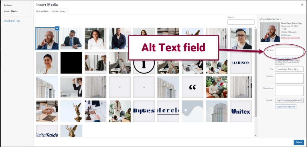
Tip: If the same image appears in different contexts, its appropriate alternative may change. A product photo, linked card image, and decorative background do not need the same text.
4. Use real links and buttons
- Use links for navigation and buttons for actions.
- Make the accessible name describe the destination or action, not “click here.â€
- Give icon-only controls an accessible name.
- Do not use a clickable container or
divwhen a native link/button works. - Ensure disabled controls are understandable and not the only way to discover missing requirements.
- Keep touch targets large enough and separated for users with limited dexterity.
ARIA can add a name or state, but it does not supply native keyboard behavior automatically. Prefer the correct HTML element before adding ARIA attributes through Elementor Custom Attributes.
5. Check text and non-text contrast
For WCAG AA, normal text generally needs at least 4.5:1 contrast and large text at least 3:1. User-interface components and meaningful graphics generally need 3:1 against adjacent colors. Test actual states: default, hover, focus, selected, disabled, error, and text over images.
- Do not communicate status by color alone.
- Check placeholder text, breadcrumbs, metadata, and footer copy.
- Test overlays across the lightest and darkest parts of background images.
- Ensure focus indicators remain visible against every surface.
6. Test zoom, reflow, spacing, and orientation
- Zoom text/page to 200% and confirm content and controls remain usable.
- Test a 320 CSS-pixel-wide viewport without horizontal scrolling for normal content.
- Increase text spacing and check clipping in buttons, cards, menus, and form fields.
- Avoid fixed heights that cut off translated or enlarged text.
- Do not lock the experience to one orientation unless essential.
Elementor responsive controls can hide one layout and show another, but two DOM versions can create duplicate content and confusing focus. Prefer one responsive component where practical. For layout-specific faults, see how to fix broken Elementor mobile layouts.
7. Make forms understandable
- Every input needs a persistent programmatic label; placeholder text is not a label.
- Required fields should be identified in text and programmatically.
- Instructions must appear before users need them.
- Group related radio buttons and checkboxes with a meaningful group label.
- Errors should identify the field, explain the problem, and suggest correction.
- Move focus to an error summary or announce successful submission when appropriate.
- Do not erase valid entries after one field fails.
- Test autofill, password managers, and keyboard submission.
Also verify actual delivery and success behavior. The guide to Elementor forms not sending email covers the operational side.
8. Review motion, video, and timed content
- Respect
prefers-reduced-motionfor nonessential animation. - Provide pause/stop controls for moving or auto-updating content where required.
- Avoid autoplay audio.
- Provide captions for prerecorded video with meaningful speech/audio.
- Provide transcripts or audio description where the content requires them.
- Do not make carousel content the only route to important information.
9. Test dynamic Elementor components
Test the name, role, value/state, keyboard behavior, focus movement, and announcements for menus, tabs, accordions, popups, sliders, carousels, quantity controls, filters, live search, cookie banners, and validation messages. A component can look correct while exposing the wrong state to a screen reader.
10. Combine tools with human testing
- Run an automated scanner such as axe, WAVE, Lighthouse, or Elementor Ally.
- Fix high-confidence errors and retest.
- Complete keyboard, zoom/reflow, and content reviews.
- Test with at least one desktop screen reader and relevant mobile assistive technology.
- Include people with disabilities in usability testing for important services.
- Record issues, owners, severity, affected templates, and regression tests.
Success: A scanner with zero errors is not the finish line. Success means people can perceive the information, operate every workflow, understand feedback, and recover from mistakes across real devices and assistive technologies.
Sources
For an accessibility and Elementor implementation review, see AbdullahWP services.