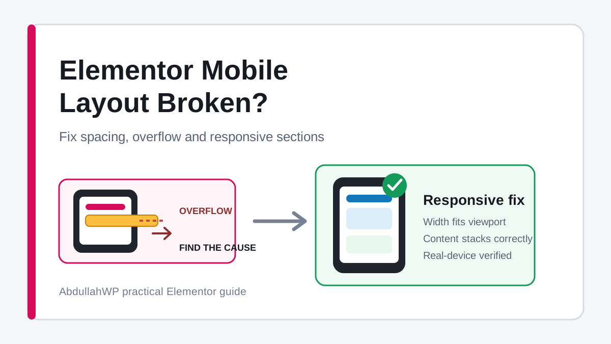
An Elementor page can look correct on desktop and still break on a phone: text sits off-screen, columns refuse to stack, a blank strip appears beside the page, or the live layout does not match Elementor’s mobile preview. These symptoms share a theme, but they do not share one universal fix.
This guide shows how to diagnose an Elementor mobile layout broken issue before changing random settings. You will learn how to find the exact overflowing element, repair spacing and container behavior, handle absolute positioning, refresh stale CSS, and test the result at real viewport widths.
Note: Do not start by adding overflow-x: hidden to the entire website. That can hide the scrollbar while leaving buttons, text, or keyboard-focusable content outside the viewport. Find and fix the element creating the extra width first.
Identify the mobile layout symptom
| Symptom | Likely cause | First place to check |
|---|---|---|
| The page slides left and right | An element is wider than the viewport | Fixed width, side margin, transform, no-wrap row, or long content |
| Columns stay side by side | Container direction or child widths are still desktop values | Mobile Direction, Wrap, and child Width |
| Large empty space above or below a section | Inherited padding, min-height, spacer, or positioned element | Mobile spacing and size controls |
| Widgets overlap | Absolute positioning, negative margins, fixed height, or transform | Position and offset values at the affected breakpoint |
| An element disappears | Responsive visibility, custom CSS, or a breakpoint rule | Hide On / Display settings and CSS media queries |
| Editor preview is correct but live page is broken | Stale generated CSS, cache, optimization, theme, or plugin conflict | Clear Elementor files/data and every cache layer |
| Only one phone or browser is affected | Browser behavior, viewport height, safe area, font rendering, or cached assets | Real-device test and remote inspection |
Fix one symptom at a time. If you change the container direction, margins, cache settings, and custom CSS together, you will not know which change solved the problem or which one introduced a new issue.
1. Test the live page at several widths
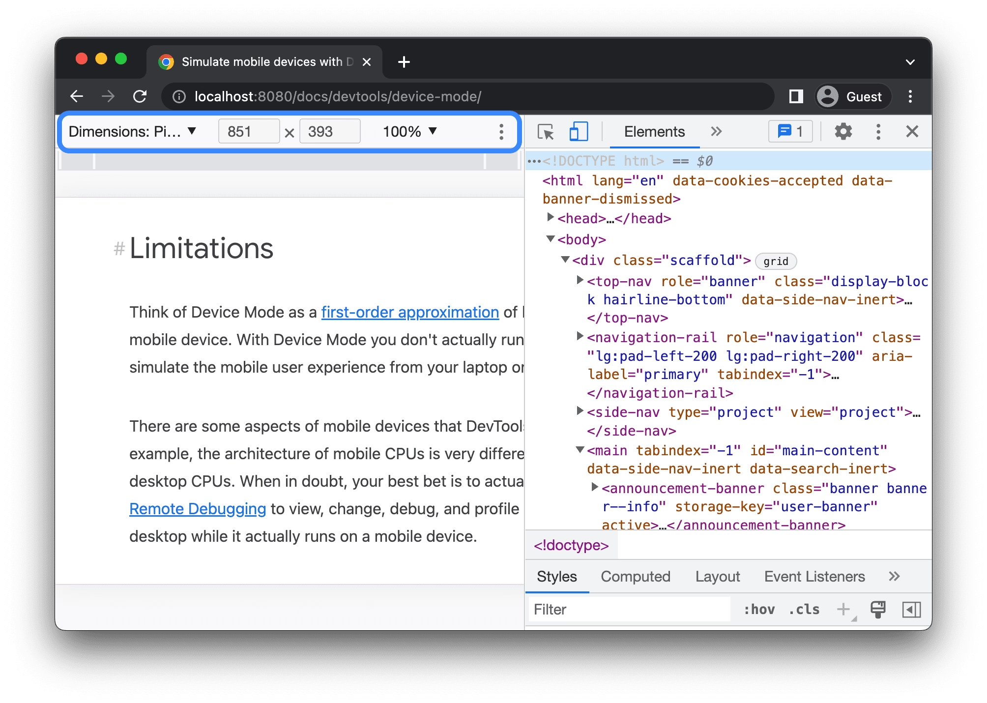
Elementor’s device icons are editing breakpoints, not a complete list of phones. The browser applies CSS according to viewport width. A layout that works at 375px can still fail at 390px, 425px, or just below the tablet breakpoint.

- Open the published page in a private or incognito window.
- Open Chrome DevTools and toggle the device toolbar.
- Test 320px, 375px, 390px, 425px, 768px, and widths just above and below your Elementor breakpoints.
- Drag the responsive viewport slowly instead of checking only device presets.
- Repeat the important tests on at least one real phone.
Tip: Write down the smallest and largest widths where the problem appears. A failure only between 768px and 900px usually points to a breakpoint or inherited tablet value, not a general mobile problem.
2. Understand Elementor’s responsive inheritance
Elementor responsive values normally flow from wider screens to narrower screens. A desktop value can be inherited by tablet and mobile until you set a narrower-device override. A tablet override can also flow into mobile.
This is why changing a mobile value may appear to do nothing: the value you are looking at could be inherited from desktop, overridden at tablet, or controlled by a different parent element. In the editor:
- Switch the canvas to the affected device before editing.
- Look for the device icon beside Width, Direction, Padding, Margin, Typography, Position, and other responsive controls.
- Check the parent container before adjusting a child widget.
- Use the Structure or Navigator panel to select elements that are difficult to click.
- Reset an unwanted override instead of entering another compensating value.
Elementor’s current responsive editing guide explains inherited values and top-down editing. Control names and panel locations can differ slightly between Editor versions, but the inheritance principle is the same.
3. Find the element causing horizontal overflow
A horizontal scrollbar is evidence that at least one rendered box extends beyond the viewport. Elementor’s own troubleshooting documentation recommends identifying the overflowing container before changing it.
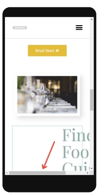
Use Chrome Device Mode at a width where the problem occurs. In DevTools, open the Console and run this diagnostic snippet:
const viewportWidth = document.documentElement.clientWidth;

document.querySelectorAll('body *').forEach((element) => {
  const box = element.getBoundingClientRect();

  if (box.left < 0 || box.right > viewportWidth) {
    element.style.outline = '2px solid #e11d48';
    console.log(element, box);
  }
});
The code outlines elements whose rendered edges sit outside the viewport and logs them in the Console. Scroll through the page and inspect the outlined element in Elementor. Reloading the page removes the temporary outlines.
Warning: Some intentionally off-canvas menus, sliders, marquees, and animation tracks extend beyond the viewport by design. Confirm that the highlighted element is causing the unwanted page-level scroll before changing it.
4. Remove fixed widths and minimum widths that cannot shrink
A 700px child inside a 390px viewport has to overflow unless it can shrink, wrap, or scroll inside a deliberate region. Check the highlighted container and its children for:
- Width or Min Width set in pixels.
- A child container with a custom percentage plus a large gap.
width: 100vwinside a padded parent.- A form, table, code block, iframe, or third-party widget with an inline width.
- A flex child whose content prevents it from shrinking.
For a typical mobile section, set the parent to Full Width, give the child a responsive width of 100%, and remove an unnecessary mobile Min Width. For two children in a row, their widths plus the gap must fit the parent. If they should stack, change the mobile direction to Column instead.
When a flex child still refuses to shrink, this narrow CSS rule can help:
selector {
  min-width: 0;
  max-width: 100%;
}
Use selector in Elementor Pro element-level Custom CSS. In WordPress Additional CSS or another site-level stylesheet, replace it with a specific class that you assign to the problem element. Do not apply a broad rule without confirming which component needs it. The CSS min-width reference explains why a minimum size can stop an element from becoming narrower.
5. Fix side margins, negative spacing, and transforms
A top-level container that already spans 100% of the viewport becomes wider than the screen when left or right margins are added. Elementor specifically warns that side margins on a top-level container can create a horizontal scrollbar.
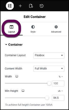
- Use left and right padding for inner breathing room on a full-width parent.
- Move intentional side margins to a child container whose width leaves room for them.
- Reset inherited negative margins on mobile unless they are truly required.
- Check Translate X, rotate, scale, motion effects, and entrance animations.
- Do not use a Spacer widget to repair alignment; fix the parent gap, padding, or justification.
A practical mobile starting point is 16px to 24px of horizontal padding on the page’s main content container. The exact value should follow the design system, but it should be applied consistently instead of recreated with widget margins.
6. Set container direction, wrap, and order
A desktop hero often uses a Row container with text and an image side by side. On mobile, decide deliberately whether those children should shrink, wrap, or stack.
| Mobile goal | Parent setting | Child setting |
|---|---|---|
| Stack text above image | Direction: Column | Width: 100% or Default |
| Stack image above text | Direction: Column Reverse, or responsive Order | Remove desktop-only offsets |
| Keep small items in rows | Direction: Row; Wrap: Wrap | Use a flexible width or sensible basis |
| Horizontal scrolling cards | Overflow: Auto on the card track only | Give cards a deliberate minimum width |
Elementor’s container arrangement guide documents Direction, Gap, and Wrap. Wrap lets items move onto another line when they no longer fit; No Wrap keeps them on one line and can create overflow.
Avoid duplicating an entire desktop section solely to reverse two items on mobile. Responsive Direction and Order usually produce less markup and fewer visibility rules. If an old section-and-column layout is difficult to maintain, review the guide to convert Elementor sections to containers without breaking the layout.
7. Repair overlapping and absolute-positioned elements
Absolute positioning removes an element from the normal document flow. The surrounding container does not automatically reserve space for it. A decorative badge that fits a desktop hero can cover text or extend off-screen on mobile.
- Select the overlapping element through Structure or Navigator.
- Check Position, horizontal orientation, vertical orientation, offsets, and Z-index at the affected breakpoint.
- Return the mobile position to Default when the element does not need to float.
- If it must remain absolute, position it relative to the correct parent and provide enough parent height.
- Check transforms and motion effects after fixing offsets.
A fixed pixel height can make the overlap worse when mobile text wraps onto more lines. Prefer content-driven height or Min Height where possible. Test with the longest real heading, translated text if the site is multilingual, and the browser’s larger text setting.
8. Contain images, videos, embeds, tables, and long text
The container can be correct while one piece of content is too wide. Common offenders include a pasted image with a width attribute, a map iframe, a scheduling widget, a comparison table, code, a long URL, and a non-breaking product name.
.mobile-safe-media img,
.mobile-safe-media video,
.mobile-safe-media iframe {
  max-width: 100%;
}

.mobile-safe-media img,
.mobile-safe-media video {
  height: auto;
}

.mobile-safe-text {
  overflow-wrap: anywhere;
}
Assign the classes only where needed. For data tables that genuinely need more width, place the table inside a clearly scrollable wrapper rather than shrinking its text until it is unreadable:
.responsive-table {
  max-width: 100%;
  overflow-x: auto;
  -webkit-overflow-scrolling: touch;
}
Do not clip interactive content such as form controls or carousel buttons. MDN’s overflow documentation distinguishes clipping from a scrollable region and notes accessibility considerations for hidden content.
9. Correct mobile spacing, typography, and height
Desktop spacing rarely scales cleanly to mobile. A 120px section padding, 80px gap, 70px heading, or 700px minimum height can make a phone layout look empty or force important content below the fold.
- Set mobile padding on the section or container, not separately on every widget.
- Use the container’s Gap control for space between children.
- Reset desktop negative margins and Spacer widgets.
- Use a readable mobile heading size and line height; do not force a headline onto one line.
- Remove fixed height when content should determine the section height.
- Check background position and focal point after the section changes shape.
If changing typography causes text to jump or wrap differently on the live page, confirm the intended font is loading. A fallback font can have different character widths and expose a borderline layout problem.
10. Restore elements hidden on mobile
If a widget disappears, inspect it through Structure or Navigator and check its responsive visibility. Also inspect the parent; hiding a container hides every child inside it.
- Elementor Hide On or Display settings.
- Responsive visibility from an add-on plugin.
- Custom CSS containing
display: nonein a media query. - Conditional display, membership, personalization, or consent rules.
- A zero height, zero opacity, off-screen transform, or lower Z-index.
Hiding large desktop sections and building separate mobile copies increases maintenance work and can duplicate content, IDs, forms, and tracking. Prefer responsive layout controls unless the mobile experience genuinely requires different content.
11. When the live page differs from the Elementor editor
If the editor preview is right and the published page is wrong, verify the delivery layer before redesigning the section.
- Update the page and confirm the correct template is published.
- Use Elementor’s Tools area to clear or regenerate generated files and data. The exact label can vary by Elementor version.
- Purge the WordPress cache plugin.
- Purge server or host cache.
- Purge the CDN cache.
- Test in a private window with browser cache bypassed.
- Temporarily disable CSS combining, unused-CSS removal, and delayed JavaScript for the affected page.
If generated CSS returns a 404 or never updates, use the dedicated guide to fix Elementor CSS files giving 404 errors. If the editor itself fails while you are repairing the page, the Elementor 500 error guide covers server-side causes.
Tip: Clear caches from the inside out: Elementor files, WordPress cache, server cache, CDN, then browser. Test after each layer when possible so you learn where stale CSS was being served.
12. Check the theme, add-ons, custom CSS, and scripts
A third-party Elementor add-on can add its own breakpoints, width rules, JavaScript measurements, or slider tracks. The active theme can also set global widths and typography. Test conflicts on a staging copy or during a controlled maintenance window:
- Save a backup and record the current problem with screenshots.
- Temporarily disable Elementor add-ons one at a time.
- Disable recent custom CSS or scripts related to the affected component.
- Test with the Hello theme only on staging if a theme conflict is suspected.
- Re-enable each component and retest the exact failing width.
Elementor’s mobile troubleshooting guide also recommends checking responsive visibility, custom CSS, plugins, themes, breakpoints, and device-specific behavior.
When is Overflow: Hidden appropriate?
After you have identified the cause, setting a specific container’s Overflow to Hidden can be correct for decorative shapes, glows, entrance animations, or artwork intentionally extending past the section edge.
| Use Hidden | Do not use Hidden |
|---|---|
| A decorative, non-interactive shape extends outside its section | A button, link, field, menu, or readable text is outside the viewport |
| An animation briefly moves artwork beyond a bounded section | A fixed width, side margin, or transform is still wrong |
| The clipping is intentional at every tested width | You are applying it globally only to remove the scrollbar |
Apply clipping to the narrowest appropriate container. Then use keyboard navigation to make sure no focusable control disappears outside the visible area.
Mobile verification checklist
- The live page does not scroll horizontally at 320px, 375px, 390px, or 425px.
- The layout remains stable just below and above every active breakpoint.
- Desktop rows stack or wrap in the intended mobile order.
- No button, field, menu, or link is clipped.
- Headings wrap naturally without covering nearby content.
- Images, videos, maps, tables, and embeds fit or scroll inside a deliberate wrapper.
- Sticky headers, popups, cookie banners, and off-canvas menus have been tested.
- Landscape orientation does not introduce overlap.
- The page matches the editor after all cache layers are cleared.
- A real iPhone or iPad and a real Android device have been checked when available.
- Keyboard focus remains visible for interactive elements.
- The page is rechecked after optimization settings are restored.
Success: A finished fix works across a range of widths, survives a cache refresh, preserves all interactive content, and addresses the offending element instead of masking the entire page.
Frequently asked questions
Why does my Elementor page have horizontal scroll on mobile?
At least one element extends beyond the viewport. Common causes are fixed or minimum widths, side margins on a full-width parent, negative margins, transforms, absolute positioning, no-wrap rows, wide embeds, and long unbreakable text. Use DevTools to identify the element before hiding overflow.
Why is Elementor mobile preview different from my phone?
The editor preview represents a viewport and may not reproduce every browser, font, cache, viewport-height, or device behavior. Test the published page in a private window, clear generated CSS and caches, and verify it on a real device.
Should I use pixels, percentages, or viewport units on mobile?
Use the unit that matches the design requirement. Percentages and flexible widths are usually suitable for container width; pixels can be appropriate for controlled padding and icon sizes. Be careful with 100vw inside padded parents and with large fixed pixel widths.
How do I reverse Elementor columns on mobile?
For containers, set the mobile Direction to Column Reverse or assign responsive Order values to the children. This is cleaner than duplicating the entire section and hiding one copy per device.
Can I fix mobile overflow with one CSS rule?
A global clipping rule can remove the visible scrollbar but may hide content. Fix the width, margin, wrapping, or positioning of the responsible element. Use container-level overflow only when clipping is intentional.
Fix the rule that breaks the viewport
The fastest reliable workflow is: reproduce the problem on the live page, record the failing widths, identify the element that exceeds or overlaps its container, and change the smallest responsible setting. Then clear delivery caches and verify on real devices.
That approach takes a few minutes longer than hiding horizontal overflow globally, but it leaves the page maintainable and keeps important content usable. For a layout that still fails after the element and cache checks, contact AbdullahWP or review the available Elementor troubleshooting services for a focused diagnosis.